.png)
.png)
.png)
1. Multimedia Principle
The Multimedia Principle states that people learn better when there is both text and graphics rather than just text alone. We applied the Multimedia Principle by implementing pictures and text pertaining to the lesson, both of which convey the same information. Combining textual and visual information enhances users’ germane cognitive load, which refers to the mental effort in the working memory dedicated to processing content that is not essential but aids in the user's learning.
.png)
2. Coherence Principle
The Coherence Principle is a concept in instructional design that suggests people learn better when extraneous material is excluded from educational content. We applied the Coherence Principle by only implementing text and pictures that relate to the lesson and removing unnecessary elements. This reduces the mental effort required to process information that is not essential to learning the core material, known as extraneous cognitive load. This refers to the type of cognitive load that is caused by unnecessary details that do not contribute to the understanding of key concepts.
.png)
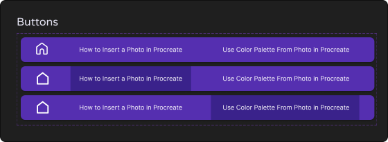
3. Hick's Law
Hick's Law states that the time it takes to make a decision increases as the number and complexity of choices increase. Taking Hick’s Law into consideration, there are only a few buttons to choose from on each page, which are the home button, back and forward buttons, and the carousel indicator.
.png)
.pdf.png)
.png)